Getting audience attention towards your PowerPoint presentation is a feat in and of itself.
To achieve this feat possibly you have spent hours crafting a winning PPT to get that attention.
Perhaps many of you likely have spent hundreds of bucks too.
But despite all efforts, you still struggle to get that desired applause from viewers. You have done all that was required to make a PPT standalone. So, the million dollar question is what went wrong?
Rest easy! We have figured out the culprit.
Well, we all know that figures or data are imperative to make an impact. The problem is that with each passing day data or figures are becoming bigger and bigger. Managing and presenting huge data or figures in an engaging manner especially the big ones is a challenge in itself.
That’s exactly the weak link where every second presenter fails to hit the captivating chord.
Mind it!
Even skipping data or figures calculatedly is not going to serve the purpose. In fact, such a strategy may backfire and perhaps will do more harm than benefit.
All you need to do is to understand the science of Data Visualization. Data visualization means the depiction of information in the form of visuals, chart and diagrams.
Well, we know many of you must be already applying charts, bar graphs and pie charts etc. to represent data. Frankly speaking, nowadays every second presenter is using such old data visualization tricks. These are good enough. But to create a jaw-dropping effect now you need to master new data visualization tricks.
To help you out, here are 10 data visualization techniques or tricks to make your PowerPoint stand out.
Data Visualization Techniques for PowerPoint Presentations
1. Speedometer Dashboard
An automobile dashboard provides information about various parameters of vehicles. In the business world, it can be applied as a metaphor of Key Performance Indicator (KPI). To put in other words, a dashboard helps to visualize figures related to sales, production, efficiency, planning, client satisfaction level or key market trends.
Download Speedometer PowerPoint Template
2. Batteries
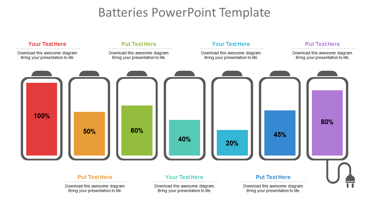
A metaphor of battery may seem simple, but it has the potential to boost audience engagement. Presenters can apply battery visuals to symbolically represent figures related to employee satisfaction surveys, energy, motivation level of employees, strength, resources, time and financial state. Best is, instead of using traditional pie charts metaphors of batteries look trendy and are easy to comprehend.
Download Batteries PowerPoint Template
3. Cylinders
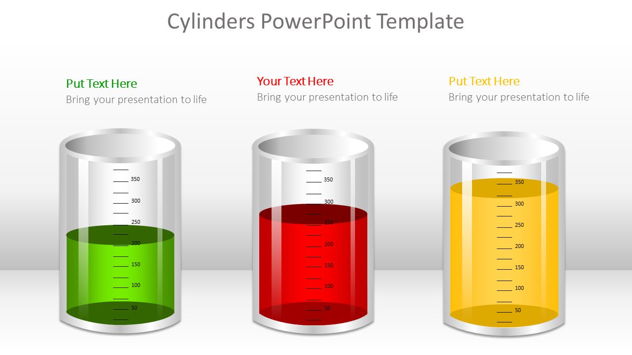
Like batteries, the metaphor of cylinders perfectly fits to symbolize figures related to targets and goals. In short, different levels of cylinders can be applied in a presentation slide to depict various business figures.
Download Cylinders PowerPoint Template
4. Thermometer
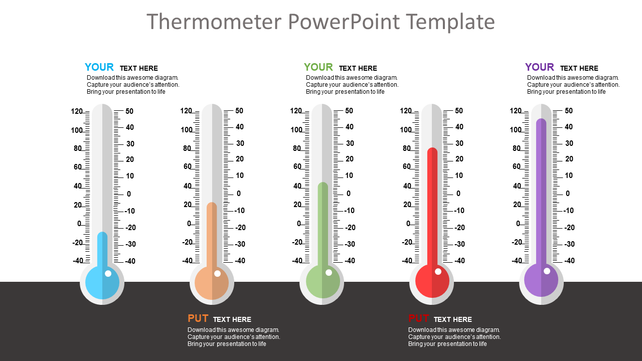
Thermometer is a perfect symbol to portray figures related to sales growth, target, production and customer base in which level of mercury represents current value, while the top of the thermometer signifies figure or goal to be achieved. Good thing is that temperature color or level can be used to exhibit or compare different business variables.
Besides this, presenters can also incorporate thermometer metaphors to depict total funds, available funds and used funds.
Download Thermometer PowerPoint Template
5. Circular Infographics
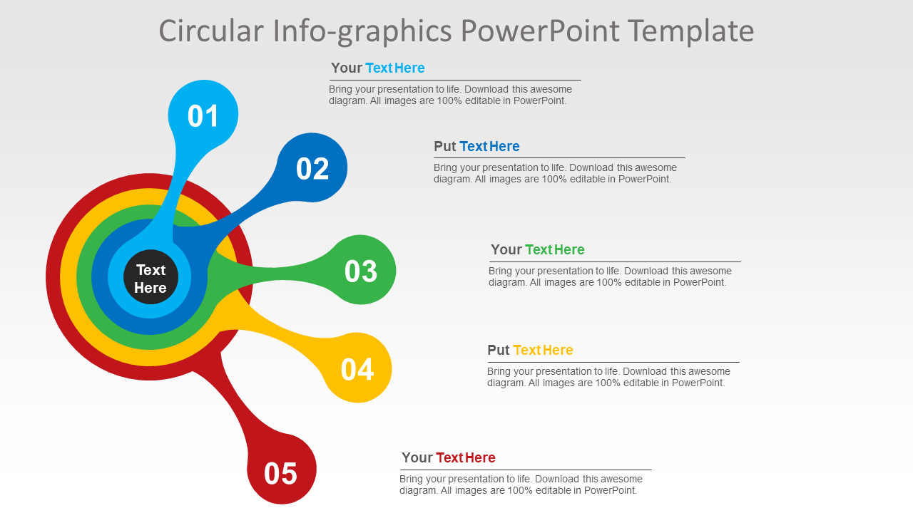
Circular infographics are the most popular and widely used designs in presentation templates. Circular shapes fit well to depict processes that are cyclic in nature thereby making them easy to understand and retain. Best is by applying circular shapes it is easy to portray even complex figures or concepts and hence have a definitive edge over other visuals.
Download Circular Infographic PPT Template
6. Innovative pie-charts
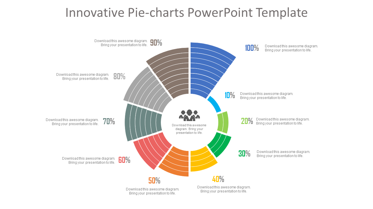
Pie-charts or area diagrams are simple but time tested visual techniques to symbolize different categories of data. In pie-charts arc length is directly proportionate to data and hence resonates perfectly with audience attention. Now, by reducing and increasing the size of each arc proportionately to data a little arty twist can be given to make it more impactful.
Download Pie-Chart PPT Template
7. Progress Bars
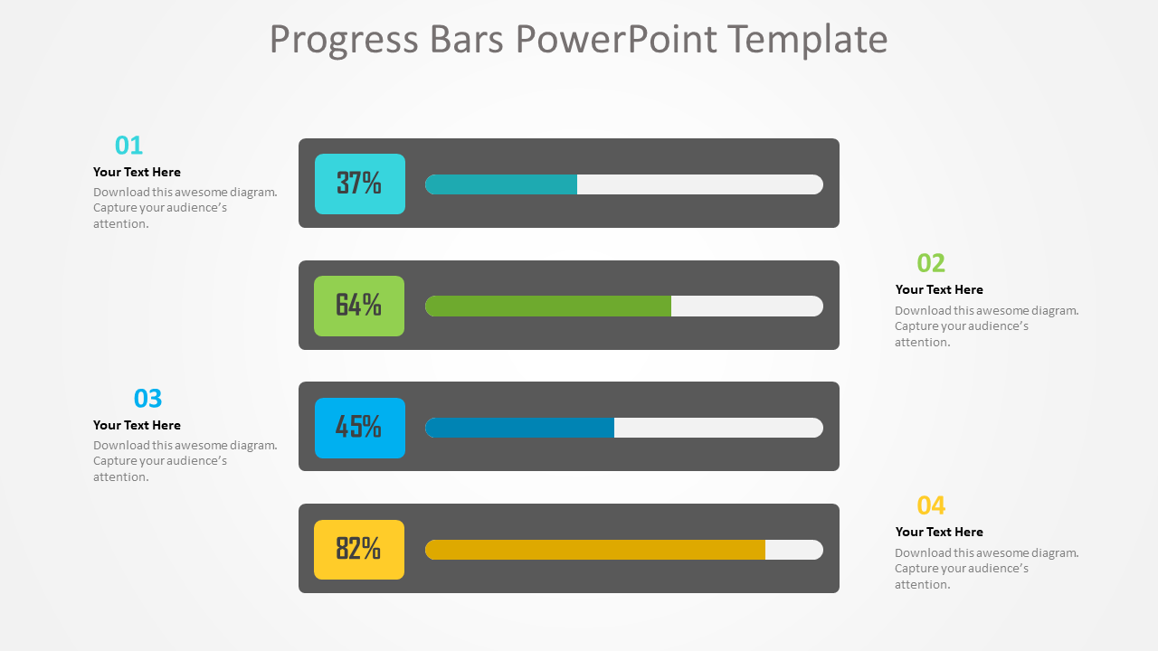
Giving a much richer experience progress bars are a powerful visual tool to illustrate weekly or monthly sales report. Showing completion percentages, progress bars inform spectators how close they are to complete a specific task. In short, as an indicator progress bar lay emphasis that a work is in process. In one line, easily comprehensible colorful visual representation greatly augments audience engagement.
Here’s the sample slide having progress bars to give a picture of various tasks advancement or progression.
Download Progress Bars Diagram
8. Measuring Scale
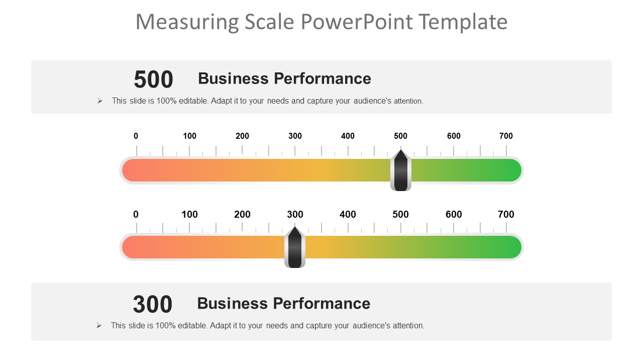
Every business house undertakes studies to analyze market trends and demand graphs. Here visuals of measuring scales can prove handy to lay emphasis on different findings or values of a survey. Data presented using measuring scale supports audience to make a quick and precise assessment.
For example, in the sample slide below measuring scale graphics are used to highlight business performance.
Download Measuring Scale PPT Template
9. Icons
Easier to read and understand an icon is a graphical pictogram to indicate a specific subject, thing or expression. Now, icons can also be used to show data in an eye-catching image format. The best thing is that with icons without relying on words presenters can explain data or figures with abstract shapes only.
For instance, in the slide below icons of humans are used to depict percentages.
Download Icons Chart PowerPoint Template
10. Creative Column Charts
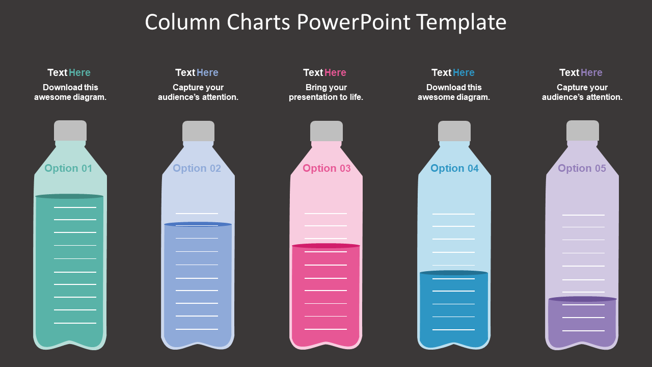
Every second presenter applies vertical bars called column charts to represent data. Each vertical bar in a column chart is proportional to the data value. Application of the column chart is a great choice to show comparisons or data changes. Now, by bringing little arty effects a presenter can make them more likeable.
Download Column Chart PPT Template
Concluding thoughts
Driving audience attention seems harder than ever before. Therefore, a presenter just cannot afford to ignore even the smallest aspect of a PPT like figures or data.
We all know that it takes a lot of efforts to generate authentic figures or data. But getting such figures and presenting them in a PPT presentation is not enough. Presenting figures as such doesn’t mean the job is done.
In fact, that’s when the real work starts – presenting them in a striking manner is also important.
To conquer this roadblock, a presenter needs to understand the power of data visualization techniques. Key is start using data visualization tricks to make figures or data easily comprehensible even for an ordinary audience.
To help you out here we have casted a spotlight on ultimate data visualization tricks. Apply them to make your PowerPoint presentation a winning one.
Tell us what your favourite data visualization trick is to make the figures look interesting.

 Home
Home 


 Customer Reviews


