

 Home
Home 


 Customer Reviews
You would have given many PowerPoint presentations by now and would have seen others giving too. Were you ever guilty of picking wrong colors for your PPT templates? Have you ever seen the audience squinting their eyes to read the text displayed on the screen even if the font size was large? Have you seen them losing interest? Blame the poor knowledge of color contrast.
Color is one of the major deciding factor for the overall impact of your presentation. It’s a widely accepted fact that colors can contribute to better understanding, memorability and learning while seeking information.
For ensuring brand consistency, most organizations today dictate the template and color scheme for all their presentations. However, some are still following the old pattern of opting colors – picking the hues they like, without giving it a proper consideration and thought. Here, you can learn beforehand about the important aspects for choosing right colors and their combinations that best suit your presentations.
PowerPoint empowers the presenters to customize the slides from a wide range of colors that can help creating graphically appealing slides. For this article, let’s focus solely on some ways of picking and using colors for text or background.
- Contrast
Many presenters get stuck while choosing the right color combination for their slides. Henceforth, to get rid of this trouble, the best strategy is to choose colors that do not blend with each other. Moreover, the basic principle for contrasting is also dependent on the surrounding elements, where little difference between objects will make it subtle and weak. So, opt for major differences between the colors you chose so that stand out and at the same time complement each other. Another key is to avoid mixing bright colors such as red, blue and green as they clash with each other causing difficulty in reading.

If stared at for long, the above color scheme will give you a headache. Select some subtle and easy-on-eyes background colors like variants of blue, green, purple, grey or white as these are best suitable for any presentation.

If you want to emphasize text or graphics, then darker colors must be chosen for foreground or text as compared to background. The reason being that in case of using a display projector, the projector is limited in colors it displays, due to which little contrast colors will be easily washed away. For better understanding, you can see the below given picture on how you can use dark colored text on light colored background and vice versa to make it much easier to be seen and read by the audience.

For a presenter using a projector for giving his presentation, the thumb rule is to use 30% darker colors in their slides to what exactly you want to be seen on the big screen.

Use 30% darker colors while working on your PC or laptop to avoid your slides from being projected like this.
- Gradient
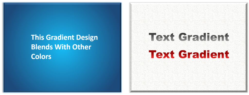
A Gradient means blend of two or more colors that gradually alters from one to another. A well-thought choice of gradient colors and mixture can open up a huge number of options to be used as the slide background. This means that professionally, the presenters can blend any set of color into one and still get attractive background designs for their slides.


A badly chosen gradient can completely ruin the look and feel of your presentation. Consider the above slides as an example. How unprofessional the above slides look owing to poor choice of gradient fills for the slide background. Selection of right colors in text and background is extremely important. Given below figures are just examples to show the right use of gradient effects.
Hope these pointers will assist you in choosing the best colors for your text and background. Little care will go a long way in enhancing the audience experience.


