Most professional designers crafting PPTs just focus on design and design only.
According to them, a design should appeal to the masses and make headlines with its creativity and beauty. Obviously, their prime target is to impress more and more audience.
But when it comes to driving maximum audience attention and bringing change, a pretty design alone won’t do. You need to understand the psychology of the audience.
For your message to resonate with that of the audience, it's paramount for a presenter to start off on right foot in all directions.
Apart from design, another simple yet important factor that needs to be considered with equal attention is Color Scheme.
In short, making right color combinations is crucial. Most PPT presenters fall short, though. So, if your presentation slides follow right color schemes you will be already one step ahead of others. For your reference here's a sample PPT slide showing disastrous color combinations.
Anyway, rest easy!
To make color chemistry comprehensible, here we are casting spotlight on some of the significant aspects about colors and color wheel.
But before going in deeper analysis, let's first have a glance of few important color terminologies.
Types of Color Terminologies
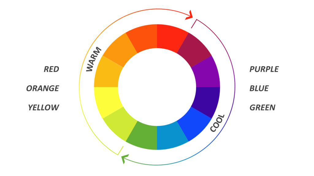
- Hue: If we look at the dictionary meaning of ‘hue’ then hue simply means ‘color’ such as red, green, blue etc. In short, it is the characteristic by virtue of which we distinguish different colors. More precisely it is the pure color that does not comprises of even a slightest of black or white color. In fact, on basis of hue we categorize colors mainly in two types i.e. Warm Colors or Cool Colors.
- Tint: Tint effect comes when we add white in a pure color thereby making it little lighter. Different tints can be produced by adding varying amount of white color in pure form.
- Shade: The difference between ‘tint’ and ‘shade’ is that in shade effect we add black in pure color to enhance darkness. So, basically ‘shade’ is the darker version of a color.
- Tone: Tone effect comes when we add grey color in pure color to bring in realistic effect. We can also say that to create a ‘tone’ we add both white and black color simultaneously in equal proportion.
- Value: Value is degree of white or black in pure colors to form lighter or darker effects or contrasts. It is measured on a value scale or grey scale to analyze the degree of value.
- Intensity / Saturation: It is basically quality of brightness or purity of a color. More is the intensity of a color, brighter it looks. On the other hand, lower intensity points towards dull color.
- Color Clashes: It is the combination of two contrasting or equally intense colors that creates a visual discomfort to eyes.
What are Warm Colors and Cool Colors?
It is a proven fact that different colors create different visual effect and hence arouse different emotions. The effect of colors can be categorized in mainly two types i.e. warm visual effect or cool visual effect.
Warm Colors: As the name signifies such colors create an effect of warmness and that’s why are known as warm colors. A close analysis of color wheel reveals that from Yellow-Green to Red all strong colors are considered as warm colors. Because of their long wavelength, such colors give a feeling as they are approaching the viewer. Presenters can apply warm colors to depict strong, dynamic feelings like passion, energy, warmth, fun, pride, strength, and happiness.
Cool Colors: Contrary to warm colors, cool colors are known to create a soothing visual effect of coolness. In color wheel, colors from Green to Violet-Red come under this category. Further, as the cool colors are of short wavelength that’s why they appear farther compared to their actual position. These colors can be applied by presenters to depict peace, tranquility, serenity, relaxation, confidence and reliability.
Enterprises often use this feature of colors as a powerful marketing tool to catch the attention of customers. Similarly, PowerPoint presentations having right concentration and combination of these colors help to magnetize audience. In short, to be a magnet, color pattern of a PPT slide should be complementary with both content and design.
An insight into Color Basics
Before diving deep further to comprehend color models let’s have a brief look at color basics.
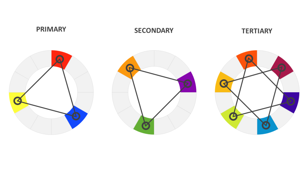
- Primary Colors: Three colors i.e. Red, Yellow and Blue are considered as primary colors. They are pure colors as they are not derived or formed by mixing other colors.
- Secondary Colors: Again three colors i.e. Orange, Green and Violet form this category. They are not considered as pure colors as they are derived by mixing two primary colors.
- Tertiary Colors: Colors from Red-Orange, Yellow-Orange, Yellow-Green, Blue-Green, Blue-Violet and Red-Violet comes under this category. As they are formed by mixing two or more secondary colors hence known as tertiary colors.
Note: Any random mixing does not form tertiary colors as all colors are not in perfect harmony with each other. A tertiary color is formed only when a primary color is mixed with secondary color next to it on color-wheel.
What are the different types of color models?
- RGB Color Model: It is an additive model in which RGB represents Red, Green and Blue color. In this model mixing of these three basic colors create a wide spectrum. For instance
Red + Green = Yellow
Blue + Green = Cyan
Red + Blue = Magenta
As mixing of these colors give white light hence electronic industry applies RGB model to manufacture TV and computer screens.
- CMYK Color Model: It is a subtractive color model in which CMYK represents Cyan, Magenta, Yellow and Key. This model comes into existence when we subtract a specific color from combination. To put in other words certain wavelength is absorbed from white light to create such colors. For instance
Green-Blue – Red = Cyan
Red-Green – Blue = Yellow
Red-Blue – Green = Magenta
- HSV Color Model: Here HSV stands Hue, Saturation and Value. This model is basically an improved version of RGB color model and hence is more users friendly. HSV color model is also considered as HSL color model where ‘L’ represents ‘luminosity’ or ‘lightness’. If we talk of PowerPoint then it mainly relies on RGB or HSL color model.
What is a Color Harmony?
Color harmony means applying different colors in an aesthetically and visually appealing combination. Such combinations can be categorized into different color schemes like Complementary Color Scheme, Split-Complementary Color Scheme, Analogous Color Scheme, Monochromatic Color Scheme, and Achromatic Color Scheme.
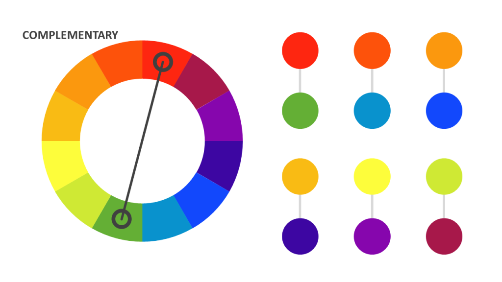
1. Complementary Color Scheme:
In this scheme colors from just the opposite ends of a color wheel are used. Such colors are contrasting in nature, for example Red and Green and hence create a vibrant or energetic visual effect. If you are looking to draw audience attention towards a specific point, then use of complementary color scheme is sensible. But, note that large dose sometimes spoils the whole arty effect as contrasting colors put pressure on eyes. So, apply it wisely.
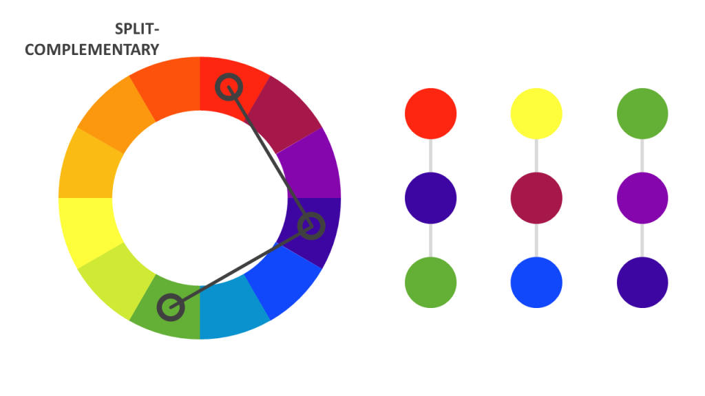
2. Split-Complementary Color Scheme:
It is same as Complementary Color Scheme but with a little variation. In Split-Complementary Color Scheme, either of the two adjacent colors to base is used to create contrasting effect. Visual effect created by this scheme is not that strong; hence put less tension on eyes.
3. Analogous Color Scheme:
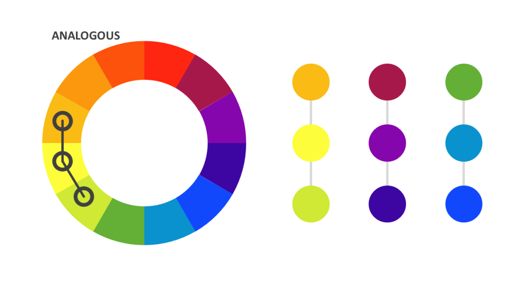
In this color scheme, colors next to base color are used to create calming visual effect as they match well. Such colors are in perfect harmony with each other, hence this color scheme also reflects unity or cohesiveness.
4. Monochromatic Color Scheme:
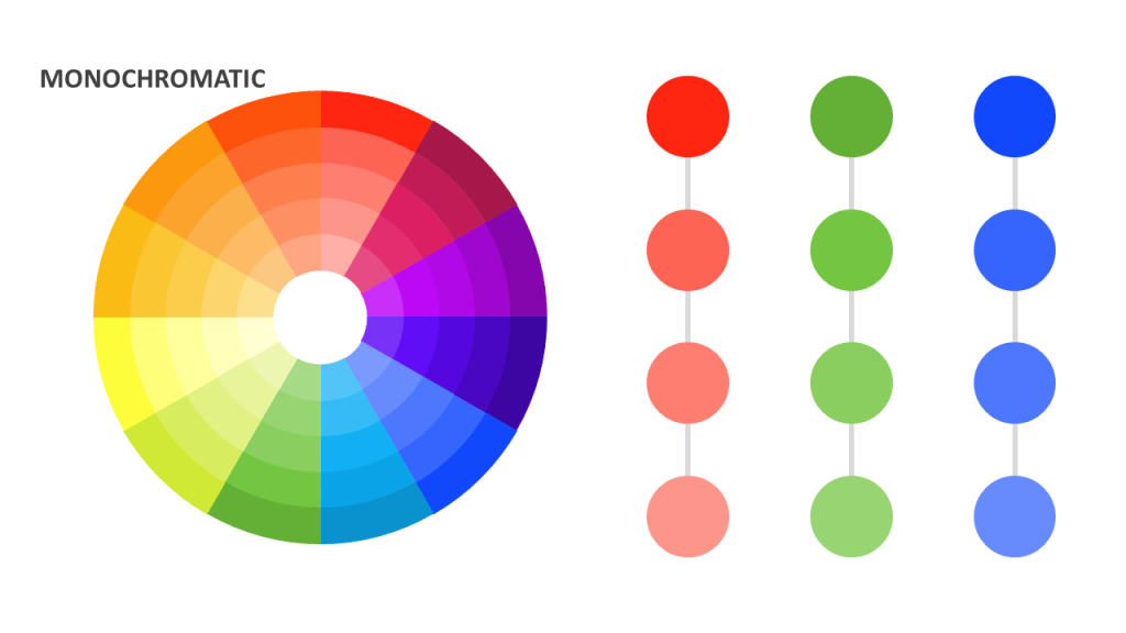
Contrary to contrasting colors, monochromatic color scheme creates color combinations using various shades of a single color. Variations can be light or dark but scheme does not include any contrast among different colors. With outlining of neutral colors like black, white or gray this scheme gives clean, polished and visually appealing images. It works well with PPT slides displaying charts and graphs where much spotlight is not required.
5. Achromatic Color Scheme:
Achromatic means 'free of color'. Going by name an achromatic color scheme has no colors except three neutral colors i.e. black, white and gray. Use of just three neutral colors gives images a unique sophisticated character and classic approach to slides. It is often known as 'black & white' scheme under which images are perceived by many as dead or empty. However, this scheme has one edge as it never distracts audience and they remain focused on content or main subject.
Concluding thoughts
When it comes to crafting a PPT presentation most professionals worry about design layout.
That is also important!
But design alone will not make a PowerPoint presentation outstanding. That's why they need to focus on color chemistry before their PPT goes live.
In fact, no matter how exceptional a design is, no matter how inch perfect the content is, if color combinations are wide off the mark a PPT is not going to resonate among audience.
In nut shell, delivering a PowerPoint presentation without right mix of colors is like driving a cart without wheels.
So, play with colors but intelligently!
Tell us which color scheme you find most useful. Share if you know more such color schemes!

 Home
Home 


 Customer Reviews


