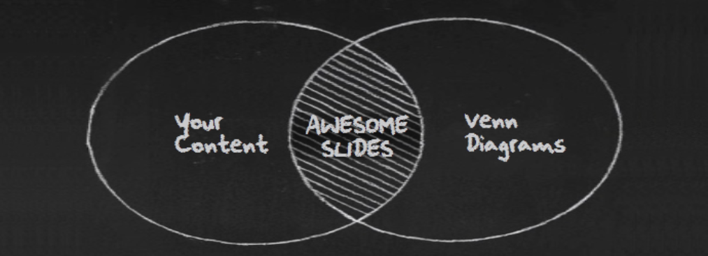
Venn diagrams are almost everywhere. They are the new age graphs and are now a pre-included feature of MS Office 2013. The advantage that Venn diagrams have over conventional graphs is that although both can be used to denote mathematical figures, Venn diagrams can also denote and compare non-mathematical figures. Venn Diagrams can make your presentation visually attractive and easier to understand. If you have ever used PowerPoint, then you would know that any diagram is better than plain text, which is boring and audience loses interest by the time they are reading the second or the third line.
Steps to Insert a Venn Diagram in Slide
PowerPoint also offers ready-to-use Venn Diagrams. Here’s how you can add a Venn diagram to a slide in PowerPoint 2013 –
- Click Insert
- Click SmartArt
- Click Relationships
- Scroll down to the last 4 options which are- Basic Venn, Linear Venn, Stacked Venn and Radial Venn
- Select the one you want and click OK

Types of Venn Diagrams
Various types of Venn diagrams are used for different purposes. They can be better understood through the following examples.
1. Basic Venn – As the name suggests, they are the most basic and the most used Venn diagrams. They are used to show overlapping or interconnected relationships between different variables. An example of basic Venn diagram would be this

From the above diagram, you can clearly explain that CRM is a combination of Sales, marketing and support.
To download a basic Venn diagram similar to this, click here.
Moving on we have another Venn diagram which is Linear Venn
2. Linear Venn- This is the second type of Venn diagram and is used to show overlapping relationships in a sequence. It is used in cases where all variables are not related to each variable.

The above diagram describes how few activities of age group 1 are similar to few activities of age group 2 and few activities of age group 2 are similar to few activities of those in age group 3 but people of age group 1 and 3 have no similar activities.
To download a similar kind of Liner Venn diagram click here.
3. The third type is Stacked Venn. This is used to show overlapping relationships and is considered a good choice for emphasizing growth or gradation of an organization or business.
Take a look at the example below.
XYZ RESTAURANTS OVER THE YEARS

Above is the diagram that explains the growth of the XYZ restaurant over the years and a similar one can be downloaded from here.
4. Radial Venn – This is the 4th and the last type of Venn diagram that is available by default in MS Office 2013. This can be used in various ways and is mostly used to show both overlapping relationships and the relationship to a central idea (organization or business) in a cycle.

Easy to explain, right? You can easily incorporate these Venn diagrams in your presentations as well.
Professional Venn Diagram Designs to Make Your Slides Look Better
Here are 4 awesome designs that have Venn diagrams. You can download these amazing designs from our website.
Technology and Human Behavior
Gadgets are the new toys of people of every age. Most businesses are developing apps and need to demonstrate the usage patterns of users across different gadgets. This Venn diagram can be the perfect answer to effectively show this information.

Team work – The smallest gear is as important as the biggest gear for a machine to work efficiently. Similarly, best ideas are generated only when all departments of an organization sit together and brainstorm. This is so because it is easier to know what is feasible and what is not. But for that it is important for them to share their ideas with each other and discuss the possibilities on the same. This is something that can’t be explained using plain text but such a slide can be helpful.

Multiple Products / Users Situation
All business organizations want their consumers to try their other products and become regular consumers of those products as well. For that reason, it is important to maintain a database of their present users and their usage patterns. Many developers who have multiple apps or games create such databases and they usually do so in a table form or general text. XYZ user has downloaded Game 1 but not Game 2, then downloaded Game 3 but decided to skip Game 4. Not only will this fail to generate any interest but is also difficult to understand. This can be solved by the following creative and easy to understand Venn diagram which will show your organizational abilities and also put you forward as a hardcore professional.

Components of a whole
Presentations delivered by academicians are often uninspiring. The number of students enrolled in different courses and the categories of students are presented as plain text and numbers. The viewers have to themselves deduce any kind of relationship amongst those categories. A Venn diagram can be helpful in situations like these. Just have a look at the Venn diagram below. This diagram is self-explanatory and can be understood in one glance. It is easier to understand that the total strength of a university also includes students who have applied for a pre-degree and also those who have passed out but still need to clear a few backlogs.

Now you have enough reasons to include Venn Diagrams in your presentations. You have seen how easy it is to insert these amazing Venn diagrams. They not only make your presentation look good aesthetically but also help you explain your data and information better. Check out more awesome Venn Diagram templates and use these ready-to-use designs for your next presentation.

 Home
Home 


 Customer Reviews


